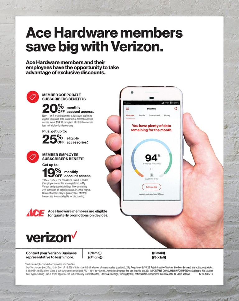
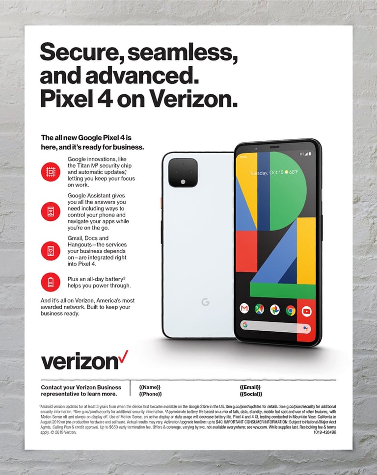
verizon
Design Refresh
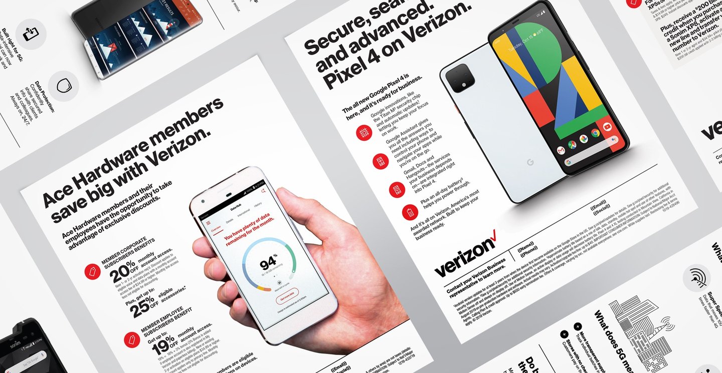
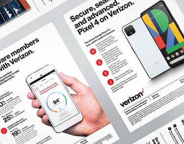
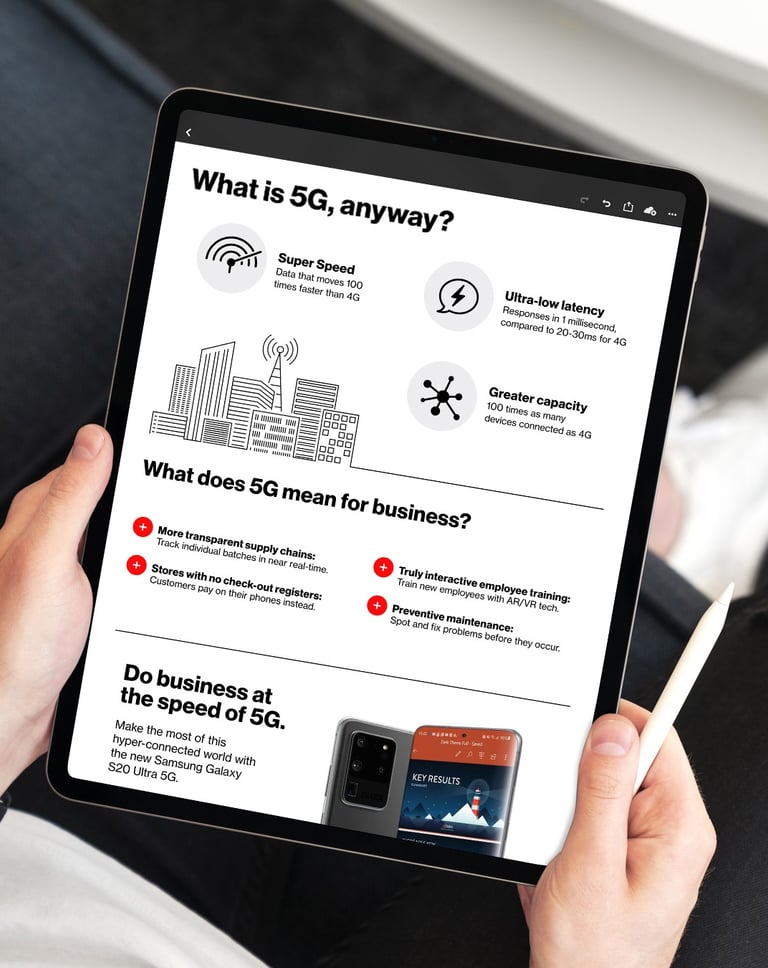
Over the years, Verizon has gone through numerous brand refreshes, yet its clean composition has always remained. Because brand compliance is a core priority, we worked within those established guidelines, but applied fundamental design principles to create pieces that feel both consistent and refined.
To elevate the designs while maintaining strict brand compliance, we applied clear visual hierarchy and introduced subtle pops of red for emphasis. Given the brand’s clean aesthetic, we relied heavily on utilizing imagery as hero visuals to capture attention and add a focal area to each piece.